How I, A Low-Tech No-Talent Noob, Made an AI-Free Book Trailer

It takes longer, but it’s worth it for the sheer satisfaction of gazing upon your work, knowing you damn well made that, with your own two hands. You know: making things. The stuff that writers and artists do.

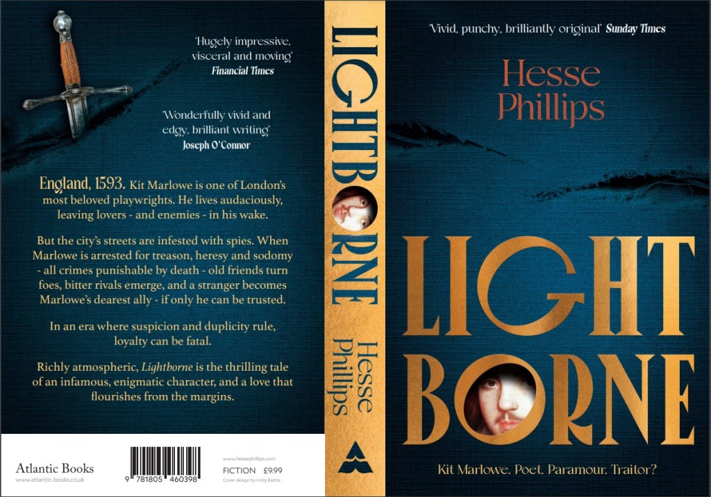
My journey towards a homemade book trailer began a year ago, as soon as I received the cover design for my novel Lightborne‘s paperback edition, which I fell in love with instantly. I could imagine the face of my protagonist, Christopher Marlowe, fading into view through the peephole of the O, the fabric background, firelit, breathing in a draft as something – a knife, perhaps – slashes right through it. Basically, I knew at first sight how I would have liked to have seen the cover animated, book trailer style.

The full-spread paperback cover of Lightborne. This is the preview I initially received from my publisher, and the image that started it all.

But sadly, an animated book trailer was not in the budget for an itty-bitty D-lister like me, so if I wanted to see that vision come to life, I had to roll up my sleeves and figure it out. Figure it out I did, using freely available video and image editing software, and the old “stop-motion” technique that gave us Wallace & Gromit, Return of the Jedi and Jason and the Argonauts, and dates back to the dawn of animation.1

This is not intended to be a tutorial. But if you, like me, are incredibly stubborn, lightly artsy, and willing to spend a good 8 hours on something you can be proud of, you too can make a book trailer with a wee carbon footprint and no sweatshop labor involved but your own.

Please note: This post is meant to inspire you, but as the title suggests, I did this despite not knowing what the hell I was doing. So no, I probably can’t help you make your own book trailer. Nor can I make it for you. Unless you pay me. A lot.

Read on if you want a breakdown of how I did it, or just scroll to the bottom to see the finished trailer in all its glory.

What I had to work with:

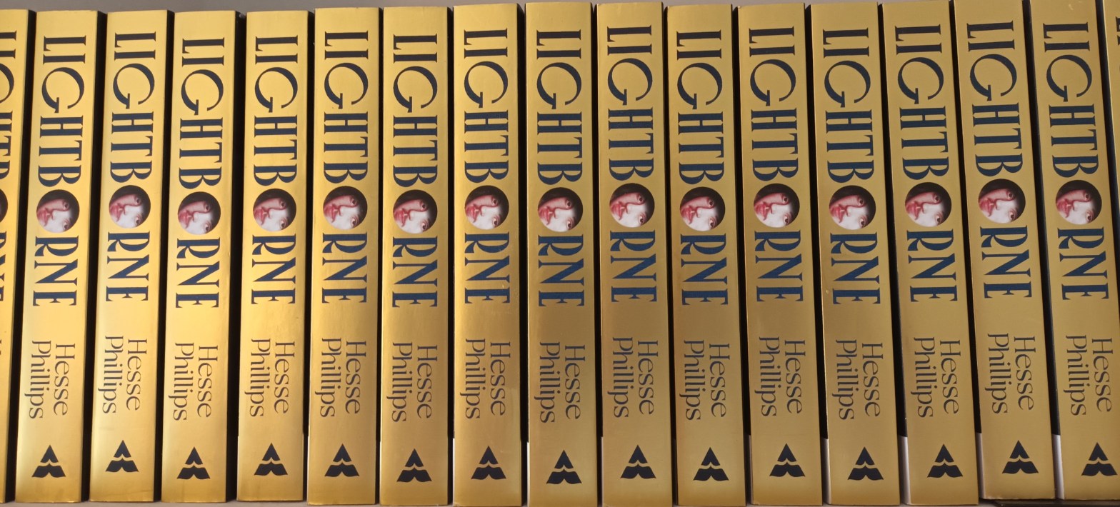
  • High-resolution image file of my cover (see above).
  • Krita image editing software (open access).
  • CapCut video editor (free version).
  • Dim memories of Photoshop 6.0.
  • That one video editing class I dropped out of in 9th grade.

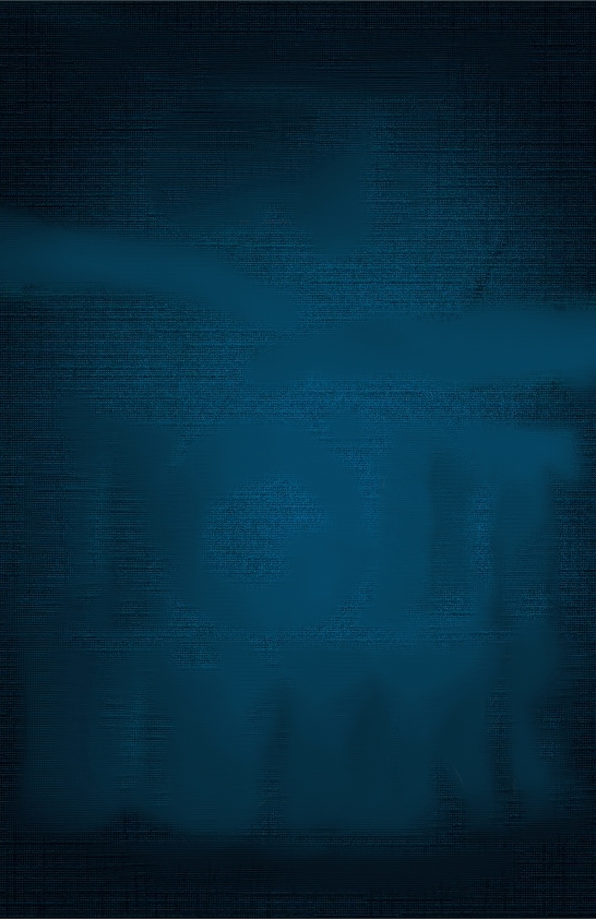
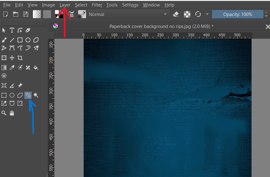
First order of business was to separate the book’s cover design into a series of layers, from background to foreground. I did this by thinking about what elements I wanted to animate, and in what order. I knew I wanted my trailer to begin with the “rips” being torn into the blue fabric, so I needed a completely clean, rip-free version of the fabric background to start with. To make this, I used the Smart Patch tool in Krita.

Blue arrow is pointing to the Smart Patch tool. I guess it’s meant to look like a cartoon Band-Aid.

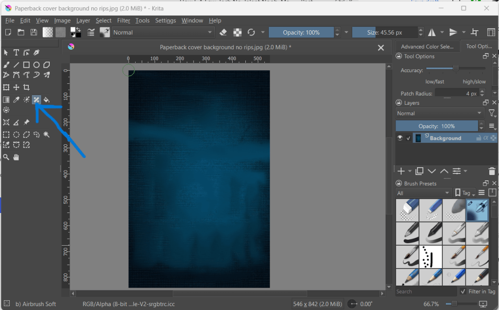
Krita is relatively user friendly if you’re familiar with Photoshop – even Photoshop from 20 years ago. I have my beefs with Krita’s interface, but with a few YouTube tutorials I was able to find my way around. The Smart Patch tool works like Photoshop’s clone or stamp tool. You hover over the part of the image you want to sample, Right-Click+Shift, and then “patch” over the part of the image you want to disappear or blend into the background.

To create an unripped version of the blue fabric, I sampled from “clean” parts of the fabric until I had patched over everything else – title, my name, the rips, etc. And yes, this took a while.

But in the end, I had what I needed – the first “frame” of my animation.

Look at it all blank and empty and lifeless, like Frankenstein’s Monster with no brain.

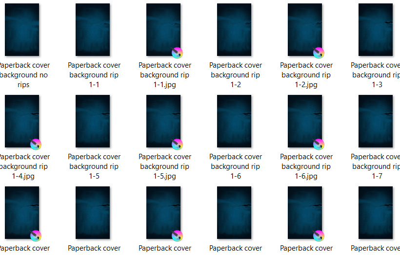
While I was doing this, I also created versions of the cover that preserved the elements I wanted to fade in one at a time in the final trailer, such as the title, the face of Kit Marlowe, my name, the tagline, etc. This also took some time.

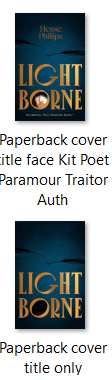
To the left you can see a couple of examples, along with my very helpful, very descriptive file-naming method. The top image was used in the final stages of the animation, because it shows most of the cover’s elements in place.

The bottom image shows a version of the cover with every element Smart Patched out except for the title and the rips in the fabric – because remember, I wanted the rips to appear first, followed by the title, followed by the face.

But I didn’t just want the rips in the fabric to gently fade in – I wanted the fabric to be torn apart right before our eyes. To achieve that, according to the stop-motion animation method, I needed a series of images that showed the fabric ripping, little by little. I had frame 1 of my animation ready. Now I needed about 30 more.

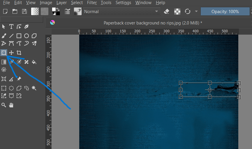
With the unripped blue fabric image open in Krita, I imported a copy of the original, high-res cover image as a Layer. Then, I cropped the image down to just the part I needed: the rip on the righthand side. Because I imported it as a Layer, what I was left with was a clipping which I could move around and manipulate as I desired, without disturbing the background.

Here you can see the right rip as a Layer over the unripped background. The blue arrow is pointing to the Freehand Selection tool; the red arrow is pointing to the Layer drop-down menu.

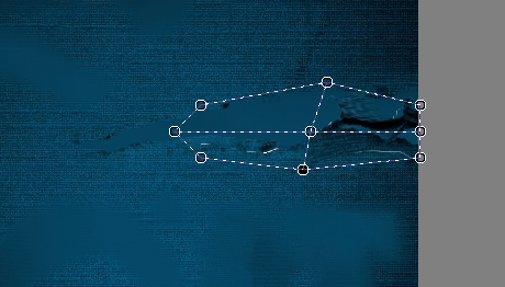
Next, I used the Freehand Selection Tool to draw an outline around the rip. The rip’s edges being messy, it didn’t need to be perfect. Once I had a dotted outline around the rip, it was time to start manipulating it. For that, I used the Transform tool, which turned my original selection into a box. So, I dunno, maybe any selection tool would have worked, not just the freehand one. Like I said, I didn’t actually know what I was doing.

Blue arrow is pointing to the Transform tool. You can see the box around the rip.

ANYWAY: next, I selected Warp from the tool menu on the righthand side of the screen.

Blue arrow is pointing to the Warp tool.

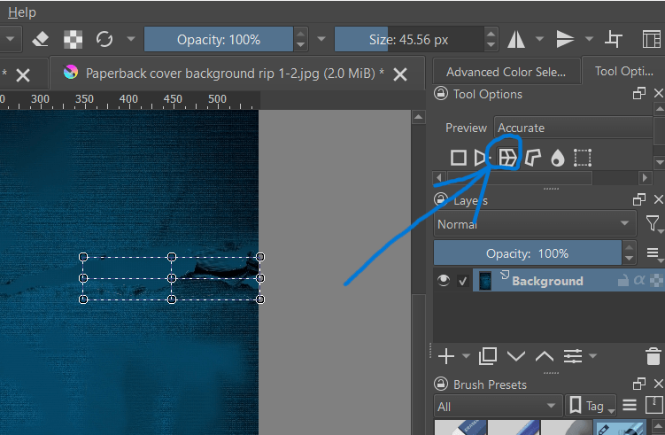
This allowed me to pull and stretch – warp – the selected part of the image using the points on the box. Because the first frame of my animation was the unripped fabric, the next frame had to show just the very beginnings of a rip. And the next frame, a little more. And the next frame, a little more.

Here you can see the Warp tool in action, squeezing and stretching the rip to make it appear gradually larger.

From that one Krita project, just by clicking “Save As” over and over, I was able to make the rip “happen,” frame by frame – just as God and Ray Harryhausen intended. Once that was done, I repeated the same steps for the left rip. All told, it took 25 frames for the right rip to complete, and 12 for the left.

A selection of the stop-motion frames I created to make the rip sequence. If you do this, make sure you number the frames carefully.

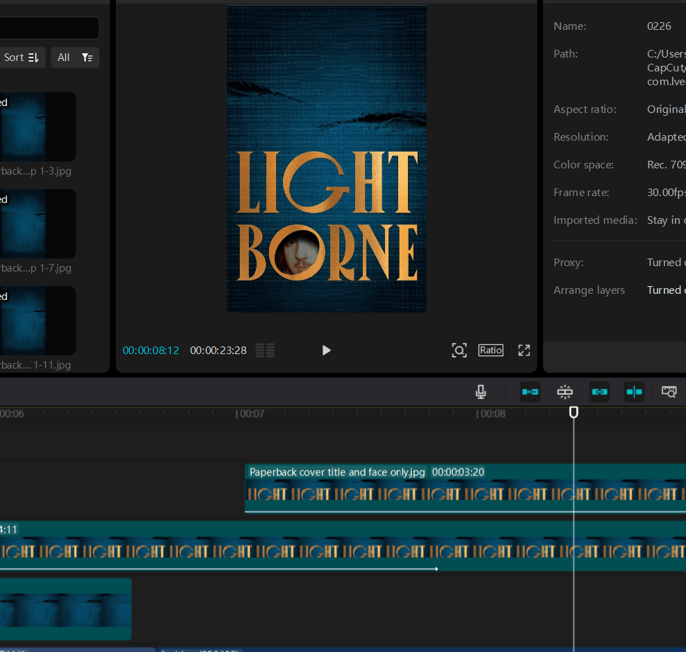
All the work I did in Krita was, by far, the most time-consuming part of the process. But now that was all in the bag. It was time to move on to CapCut.2

CapCut project screen with the book trailer for Lightborne loaded. I’m using version 4.6.0.

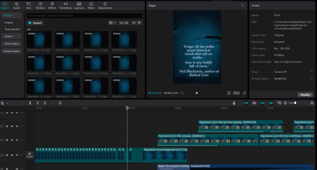
CapCut looks complicated, but it’s a drag-and-drop platform, so even a luddite like me can use it. (And it’s certainly not the only platform out there either!) In the top left corner, you import whatever image or video files you intend to use in your project. Right of that is the preview box, so you can see what your video looks like as you work. Across the bottom of the screen is your actual workspace, where you can drag and drop in your images frame by frame and layer by layer.

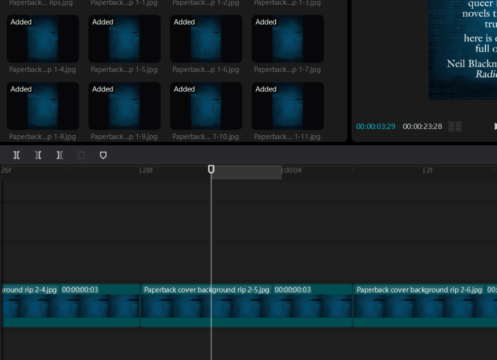
I started by importing all the many, many “rip” animation frames I had created, in the proper sequence. Then it was just a matter of adding them to a playback track, or layer, which is done with a click. The transformation from static frames to animation was instantaneous. A bit of tweaking with the playback speed, and my blue fabric ripped – not perfect, but this isn’t about smooth, shiny perfection. We want “handcrafted with love.”

Top right you can see the imported animation frames, ready to use. Below, the playback with the frames in place. I found that giving each frame a duration of .03 seconds gave the most lifelike result.

Now, I had to make the other elements of my cover fade in, one by one. Remember, I had already created numerous versions of my cover, each with different elements Smart Patched out. Now it was time to use them.

To make the title fade into view, I imported the image of the cover with all elements removed except the rips and the title text. Importantly, I added this to a playback layer separate from the ripped fabric layer, and dragged it to pick up at about the same point where the rip sequence ended, leaving a little overlap, but not too much.

In the bottom playback layer is the ripped fabric animation, showing where it overlaps with the title image in the layer above it. As one layer fades out, another fades in.

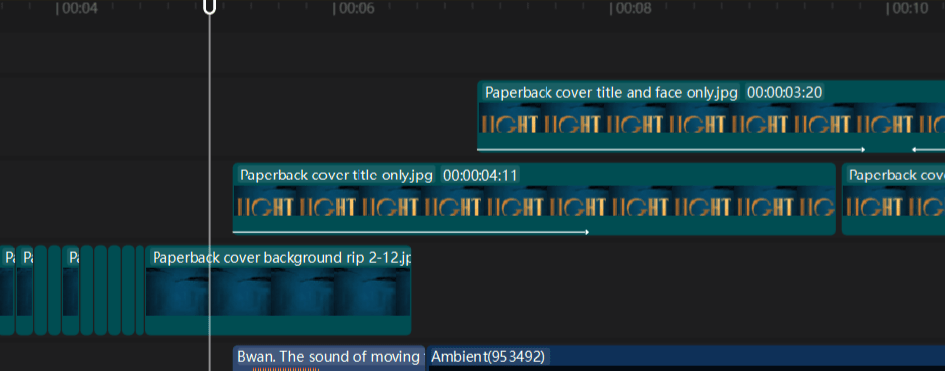
I then used CapCut’s library of free effects to make the title text fade into view by applying the Fade-in effect to the title layer. Because I only overlapped the two playback layers slightly, this created a “firelight” effect all its own, as the rip sequence layer faded to black and the title layer faded in. Which was a nice surprise.

Using another image file that preserved the rips, title, and face, I repeated these steps to make the face of Kit Marlowe fade into view inside the O in Lightborne. Looked pretty cool, if I do say so.

Here you can see the face just fading into view on its separate playback track (top).

As you can see from the image above, it took three playback layers to get to this point, but it was really just a matter of moving them around and playing with the Fade filters until they did what I wanted. Rinse and repeat with the other image files I had created in Krita, letting each element fade in one by one, and soon I had a pretty nice looking book trailer. But it still needed a little pizazz.

To add additional text and audio, I used CapCut’s built-in library of fonts, sound effects, and rights-free music. I went through at least 15 different versions of the sound of fabric ripping before I found the right one. Fire crackling – that was easy. And although the perfect music took much longer to find – a bit creepy, very atmospheric, not too modern – once I knew I had it, the whole room lit up.3

At long last, I could hit “play” on my very own, homemade book trailer – a fair approximation of the vision that had sent me careening down this rabbit hole in the first place.

Oooooooh, aaaaaaaaahhhh.

“Wow, Hesse, that seems like a lot of work for a 30-second video. Was it worth it?”

Depends on how you measure worth, I suppose. I doubt the trailer sold too many books, if any. It sure as hell didn’t go viral or even get tons of “likes” on the socials. But I didn’t make my book trailer hoping it would go viral. I made my book trailer to celebrate all the hard work I’d already put in, and to showcase what I still think is a beautiful, evocative cover design. It was hard work, but it was also a lot of fun.

I’m sure some people think I’m nuts for going to all this trouble when I could have achieved something similar, and flashier, just by plugging a prompt into a chat-box. And I’m sure some people think the finished product looks like crap and I should have spent my precious time doing something else. But, you know – I just don’t care. I made something; I learned something; I learned that I could do something I didn’t know I could. That’s its own reward.

I already spent years writing a book, after all. What’s 8 hours compared to that?

  1. Okay technically I was using what’s known as the traditional animation technique because it relied on 2D images, but I got the idea while thinking about Phil Tippett and how fucking awesome he is, so let’s just call it stop-motion in honor of him. ↩︎
  2. CapCut has, since the making of my trailer, loaded itself up with “AI powered” features. However, like most platforms that claim to be loaded-up with “AI powered” features, you can still use the thing without touching them. They’re just there in the corner of the screen, begging for your attention like Clippy of MS Word yore. ↩︎
  3. This was done before AI-generated music basically wiped-out what I imagine must have been a thriving cottage industry of rights-free music composers (so, like, a year ago). If you want human-made music to underscore your trailer, you might have to dig a bit deeper in CapCut’s library nowadays. But again – it’s worth the effort. ↩︎

Lightborne Updates: Paperbacks & Staying Alive

I must admit I love a good paperback. Smaller, lighter, easy to carry, a paperback book feels like a close friend. I love the subtly textured surface and faint newsprint smell of the paper, and the way the spine of a truly beloved paperback becomes grooved and whitened with age. Hardbacks are great and all, don’t get me wrong – but a paperback is a living thing.

So naturally I was giddy with excitement when my complimentary author’s copies of the forthcoming Lightborne paperback edition showed up at my door the other day. I’ve seen PDFs of the new cover and therefore thought I knew what I was getting into when I opened the box, but no PDF could possibly do it justice.

I think someone in the design department at Atlantic Books must have heard me going on and on about how much I loved the gold on the “deluxe” edition cover from last year, because they went all-out with it. Believe me when I tell you, this baby glows.

And it looks pretty great from the back too.

With the official paperback launch date set for 6 March, preorders are of course available (and encouraged!) But for those who prefer ebooks, the ‘Zon is also running a Kindle Deal on Lightborne for the month of February, where you can score a copy for just £2.19.

It should probably go without saying that all of this is coming at an exceedingly weird time, particularly yet not exclusively if you’re American like myself, and particularly yet not exclusively if you happen to also be queer, and writing queer books, and plan to continue being and doing all of those things for as long as you have breath in your body. I am glad, at the very least, that I made some difficult but necessary decisions to start out the year, and intend to carry that energy with me into whatever comes next.

The intersection of my self and my obsession with history means I cannot avoid writing about queer survival under truly intolerable conditions – history is sadly saturated with them. It also means, of course, that not everybody makes it out alive, and those that do emerge scarred, battered, and at least a little bit broken. But we will always have a future, even in the bleakest of times. History may often show us in our darkest hour, but it also offers hope: we’ve always been here, and will always be here.

For me, the most important words I wrote in Lightborne were these:

You must live because I love you – because you must be avenged
– because to live is a form of vengeance, when so many have
sought to destroy you
.

Sometimes it comes down to that: staying alive. Because us staying alive really pisses off the ‘phobes.

And if I’ve learned anything about myself this year, it’s that I get a kick out of pissing off ‘phobes.

Lightborne Updates: UK Paperback Sneak Peek

I can’t help but want to talk about perhaps too many things in this post, as I know many of us are still reeling after last week. Perhaps shocked and blindsided, perhaps proven right in the worst way possible, perhaps teetering just above despair. Anyone celebrating is invited to leave at this point. Anyone lashing out, lighting fires, throwing blame at those more vulnerable than themselves, screeching “I told you so” as they rub salt into others’ open wounds, is invited to seek therapy.

It feels very strange and not a little delusional to be talking about my book at a time like this. Not that it doesn’t feel strange to talk about the future at all, given how little we can say for certain about it, other than that things look bleak. They certainly look bleak if, like me, you are a queer author who writes queer books. As I discussed at length in my previous blog post, we could easily be entering a dark age in terms of art and literature, an age in which books like mine will become hotly contested objects. But it’s one thing to worry about whether or not your book might still be legal in your home country a year from now, quite another to worry whether you, as a human being, will also be legal: your marriage, your passport, your family, your friends, your livelihood, your joy, your resistance, your thoughts, your dreams.

However, as a number of other queer authors have also pointed out, there’s no sense whatsoever in backing down before the fight has even truly begun. We are already tired, especially those of us who have been targeted before, but I hope we are far from giving up. Now is a time for those of us who can afford to be loud to scream with all our might.

Knowing my history as a queer person is a double-edged sword, because I’ve seen my community in its darkest hour, but I’ve also seen us emerge from that darkness, again and again. Whatever is coming, we have every right to feel dread in the pits of our stomachs, but also every reason to believe we will find ways to survive it. As Marlowe says in Lightborne, “to live is a form of vengeance, when so many have sought to destroy you.”

As long as humanity lives, we live. I’m sure it drives those who hate us crazy.

All that said, I’m extremely lucky to have exciting things to look forward to in 2025, among them the paperback launch of Lightborne in the UK. Come what may, in March there will be a whole new edition of the book out in the world, with a stunning new cover to rival the old one.

And now, without further ado:

Courtesy of Atlantic Books

We still have the beautiful gold accents that gave the original cover such a bold presence on the shelf, but now with a much darker, moodier atmosphere, and even a subtle appearance from Kit Marlowe himself. I chose this design among several options – it wasn’t easy, as they were all impressive – but I loved this one for that rich blue tapestry background, and the vintage feel of the design.

The back cover, I should add, is equally gorgeous:

Courtesy of Atlantic Books.

Those who have read the book already will surely recognize Frizer’s knife peeking out! I fought for that knife, I will say, and I’m so glad I did. Authors – this is me advising you to fight for things you want on the cover. You might not get them, but you’ll have no regrets.

I’m beyond excited to see the paperback in its full glory, as I hope readers will be as well. Whatever dangers are barreling down at us from the future, I hope we’re able to find reasons to stay excited and engaged. After all, the world desperately needs that from us. Our anger and outrage is necessary, but so is our hope, our creativity, our joy.

It might mean the difference between simply getting through whatever comes next, and doing the work that desperately needs to be done: of building a better world than the one we started with.

Lightborne Updates: Cover Sneak Peek!

Before we get into the thing you’re actually here for, let me start this one off by saying, if you’re not listening to the 7AM Novelist Podcast with Michelle Hoover, then start now – not just because yours truly makes the occasional appearance on the show, but because I do so in excellent company. This latest season features an all-star cast, including Anjali Duva, Ron Maclean, Nancy Crochiere, Sara Johnson Allen, Marjan Kamali, Joanna Rakoff, Emily Ross, Andrea Meyer, Virginia Pye, Henriette Lazaridis, Colwill Brown, Crystal King, Chris Boucher, Dawn Tripp, Hank Phillippi Ryan, Mark Cecil, Jenna Blum, Jane Roper, Ethan Gilsdorf, Whitney Scharer, Shalene Gupta, Louise Miller, and many more, all ready to help struggling writers work through whatever’s holding them back from getting words on the page.

Recently there were two back-to-back episodes dealing with the stressful process of publishing your first book, as Aube Rey Lescure hopped on to discuss the launch of her debut River East River West, and Kasey LeBlanc, Christine Murphy, and Aaron Hamburger came on to talk about the travails of starting book 2. Listening as someone who can relate all too well to the topics at hand, I found my mental state veering wildly between excited and despairing, inspired and terrified.

Let’s be real: publishing a book is the thing we writers tell ourselves will finally make our lives fall into place, fix our self-esteem issues, vindicate our hard work, even solve lifelong crises of identity. For over a decade, it was the thing I felt I had to do, if only to justify the time and money I’d sunk into writing my soon-to-debut novel, Lightborne. And of course, I am thrilled beyond belief that it is finally happening. But I’m also learning that publication will fix absolutely none of the above problems. It will, in fact, create a few new ones.

Now that debut authors are speaking more openly about the mental health struggles they face in the lead-up to pub day, what emerges is the clear need for us to support one another. The tawdry, soul-crushing business of self-promotion can feel desperately lonely; the burgeoning public exposure can make you paranoid and crash whatever modicum of self-esteem you’d built-up since surviving high school. The dark, primal urge to dig yourself a burrow and hide in it starts to take over.

But this is why community is so essential to the debuting author. It may come via social media, or through writing groups and classes, or – just maybe – through fellow listeners of a writing podcast. I’m very fortunate to know many of the panelists on the 7AM Novelist through the legendary Boston writing center, Grub Street, where I participated in the Novel Incubator Program some [cough cough] years ago. But one of the great things about the 7AM Novelist is how it allows writers from all around the world to make connections. Seeing ideas exchanged and friendships forming in the chat box during every live episode recording truly warms this withered old heart.

So I very much hope anyone reading this will be sure to check out the show and support the author panelists: google them, subscribe to their newsletters, buy their books! This season is particularly exciting because every episode deals with questions submitted by listeners – even though I’m on again tomorrow, Jan 11th, I still don’t know what topic we’re going to get. So if you have a sticky issue to work out with your WIP, your writing practice, or career, please do go to the podcast page and submit your answer to the question, “What’s holding you back?” Maybe I’ll even get a chance to help you through it.

And now that you’ve scrolled all the way down here, you may collect your reward: a first look at Lightborne’s lush, evocative final cover!

Via Atlantic Books

As you can see, the cover will build on the proof design, using the same black and gold damask pattern and a simply gorgeous font based on 16th century typography. I’ve been informed that the pattern will, in fact, be stamped in gold foil – so in person, it’s going to be stunning!

Preorders are rolling out, so please check with your local booksellers. For those who use NetGalley, ARCs will be available soon.